Human Interaction Guidelines- iOS Part 01

Hi apple lovers,
This article is going to be first part of iOS app development. Before drive into code, we all needs to get some basic idea what are the human interaction guidelines, we have to follow to when we are developing an ios app.
At the end, you will get a high level of idea on human interaction guidelines as a beginner.
This blog will be covered the basic topics in the below.
Interface Elements
iOS Primary Themes
Design Principles
App Architecture
Let’s look into each topic as mentioned above.
Interface Elements
Currently most of ios apps built using UIkit.
What is UIkit ?
UIkit is a programming framework that defines common interface elements. It provides consistent appearance, high level of customization, flexible, familiar, adaptable and automatically update when the system introduces appearance changes.
We can consider Bars, Views and Controls as the interface elements.
Bars : contains buttons, provide navigations, used to communicate information

Views: contains animations, text, graphics and etc, shows the primary content people see in your app

Controls: contains buttons, switch, text field, progress indicators, used to initiate actions and covey information.

As some other frameworks are used in iOS developments are ApplePay, Health kit and Research Kit.
iOS Primary Themes
There are three primary themes; Clarity, Deference and Depth.
Clarity: Highlight important content and convey interactivity using negative space, color, fonts, graphics.
Deference: Fluid Motion helps to build beautiful interface help people understand and interact with content while never competing with it.
Depth: Distinct visual layers and realistic motion convey heirachy and facilitate understanding.
Design Principles
Now let’s see, what are the design principles we have to follow when designing ios apps.
Aesthetic Integrity: describes how well an app’s appearance and behavior integrate with function.
Consistency: describes how to implement app according to standard and paradigms by using system-provided interface elements. (icons, standard text style)
Direct Manipulation: describes the users experience direct manipulation when they rotate the device or use gestures to affect onscreen content.
FeedBack: Feedback acknowledges actions and shows result to keep people informed.
Metaphors: People learn more quickly when an app’s virtual objects and actions are metaphors for familiar experiences.
User Control: An app can suggest a course of action or warn about dangerous consequences
App Architecture
Launching
The launch experience has a significant impact on the way people feel about the app.

Launch experience should be fast and seamless.
In designing launch screen, the following guidelines should be follow.
Provide a launch screen the moment your app starts and quickly replaces it with your app’s first screen.
Launch screen should support appropriate orientation both portrait and landscape.
Avoid asking for setup information up front because people expect apps to just works.
Avoid showing in-app licensing agreements and disclaims because it already shows when downloading the app.
Restore the previous state when your app starts.
Don’t encourage rebooting
Avoid asking people to rate your app too quickly or too often.
OnBoarding
In onboarding, it welcome new users and reconnect with returning ones.
We need to design the onboarding according to following guidelines given below.

Provide onboarding that helps people enjoy your app, not just set it up.
Get to the action quickly
Anticipate the need for help
Stick to the essentials in tutorials as it’s fine to provide guidance for beginners.
Make learning fun and discoverable.
Loading
If the a blank or static screen shows when loading the app, people may get confuse and causing people to leave your app.

Make it clear when loading is occurring.
Show the content as possible
Modality
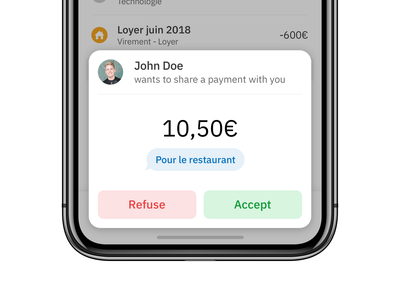
Modality is a design technique that presents content in a temporary mode that requires an explicit action to exit.
To enable various system-defined modal experiences, iOS provides alerts, activity views, share sheets, and action sheets. To present custom modal content in your app, you can use one of the following presentation styles.
- Automatic. Uses the default presentation style, typically a sheet.
- Fullscreen. Covers the previous view, and requires a button for dismissal.
- Popover. Presents a popover in a horizontally regular environment and a sheet in compact environments.
- Page sheet and form sheet. Partially covers the previous view; for guidance, see Sheets.
- Current context. Covers a particular previous view.
- Custom. Uses custom animation to present content in a custom container

Use modality when it makes sense.
Reserve alerts for delivering essential — and ideally actionable — information.
In general, keep modal tasks simple, short, and narrowly focused.
Consider using a fullscreen modal style for immersive content or a complex task.
Always include a button that dismisses the modal view.
When necessary, help people avoid data loss by getting confirmation before closing a modal view.
Make it easy to identify a modal view’s task.
Choose a modal transition style that makes sense in your app.
Coordinate the modal view’s appearance with your app.
Navigation
Hierarchical Navigation
Make one choice per screen until you reach a destination.

Flat Navigation
Switch between multiple content categories.

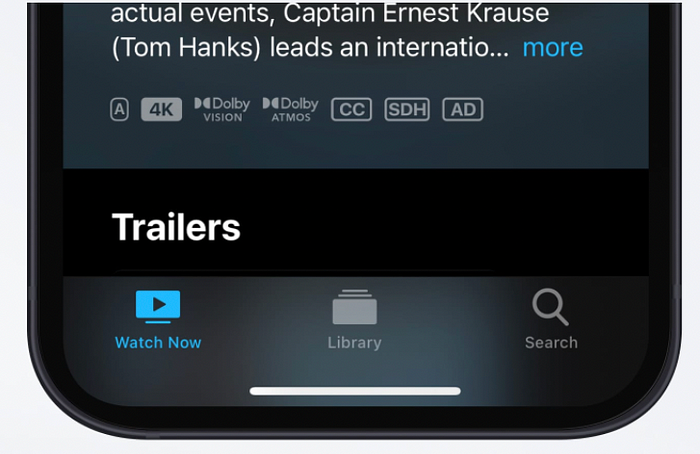
Eg Music and App Store
Content-driven or Experience-driven Navigation
Move freely through content or the content itself defines the navigation.

Eg: Games, Books
We have to follow below guidelines in navigation.
Always provide a clear path.
Design an information structure that makes it fast and easy to get to content.
Use touch gestures to create fluidity.
Use standard navigation components.
Use a navigation bar to transverse a hierarchy of data.
Use a tab bar to present peer categories of content or functionality.
On iPad, use a split view instead of a tab bar.
Use a page control when you have multiple page at the same type of content.
Accessing User Data and Resources
User privacy is paramount. To help people trust your app, it’s crucial to be transparent about privacy-related data and resources you require and how you use them.
Ex:
Personal data, including location, health, financial, contact
User generated content like emails, messages, calendar data, contacts, audio, video
Protected resource like Bluetooth peripherals, home automation features wifi connection and local network.
Device capabilities like camera, and microphone.
When requesting access permission, consider the guidelines below.

Request permission only when your app clearly needs access to the data or resource.
Request permission at launch only when the data or resource is necessary for your app to function.
Write copy that clearly describes how your app uses the data or resource you’re requested.
Settings
Some apps may read to provide a way to make setup or configuration choices, but most apps can avoid or delay doing so. Successful apps work well for most people right away, while also offering some convenient ways to adjust the experience. When we design the app to function the way most people expect, you decrease the need for settings.
You have to,

Infer what you can from system. If you need information about the user, device, or environment, query the system for it.
Thoughtfully prioritize configuration options within your app.
Expose infrequently changed configuration options in settings
Provide shortcuts to settings when appropriate.
Thank you for reading this article. Let’s meet you all at another article about human interaction guidelines.
